- Annual Financial Reporting Automation, amplifying efficiency, accuracy & profits
- Online store’s data Integration with SAP, Salesforce, Paypal, and PIMCore
- Bazaar Voice Integration for Agricultural Cooperative based Industry
- Booking Reservation Module for Leading Hospitality Company
- Role-Based Document and Apps Portal: Streamlining Access and Management with Azure
- Effective Workflow Approval and Document Management for Logistics Leader
- Increase in Real Time Media Transcript Generation by 7X, Reduced System Errors by 90% and Improved S
- Managing 500 million pageviews/month without a single downtime
- Automating Media Conversion and share to generate additional Revenue for Global Media Giant
- Seamless Sports Facility Booking System for Infrastructure Development Company
- Optimizing Exchange Server for better managed Email flow for Mining Company
- Improving End User Experience & Gamifying for leading Media & Broadcasting Company
- Helping Client to Increase Leads and Manage existing Accounts to generate Opportunities
- Provided Flexible Solution to Enhance User Experience, Manage Marketing and Customer Engagement
- Our solution helped in improving overall Website performance, Increase in Online Bookings & Sales
- Vital Lifesaving Information Solution for leading Canadian Healthcare Company
- Robust, Scalable and Cost-Effective Pimcore CMS solution for a Healthcare organisation/institute
- MS Dynamics CRM Solution to Increase Leads generation and add value to existing Accounts
- Kentico Implementation Helped Our Client in Improving User Experience, Increase in website traffic
- Improved Customer Engagement, Increased Website Performance & Search Experience Post Implementing
- Powerful API, Seamless Integrations, Intuitive and Flexible Content Management
- Innovative Pimcore Web Solution for Infrastructure Development Company
- Enhanced User-Experience, Easy to Maintain Document Management System with Workflows
- Flexible Data Model, Product Variations and User Friendly Configuration of Product Information
- Taxlinked Tokbox - International Online Tax Community based outskirts of Europe
- Powerful Data Migration Tools, Easily Maintainable Document Management System, User Friendly
- Classic Holidays - Australasia’s largest privately owned Resort
Rich Visualizations, Innovative and Interactive Dashboards for Website Traffic Analysis
Objective
Analyzing the website traffic data as it contains the following fields,- Country or region
- Date
- Section
- Number of Visits
- City
- Page
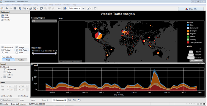
The below dashboard shows a website's traffic trends by country and number of visits in a given time period.
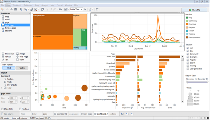
The below dashboard is about section visited, average time on page and no. of page views.
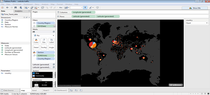
The geographical representation of no. of visits of website. The different colors of pie chart on map are the different sections of website. Represents in which country no. of visits are maximum and minimum.
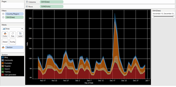
This area chart represents the timely trend of the visits.
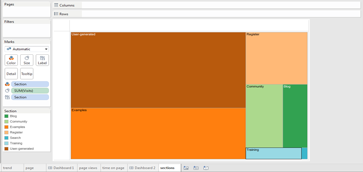
Number of visits by section. Here the colors represent the different sections of website the people visited.
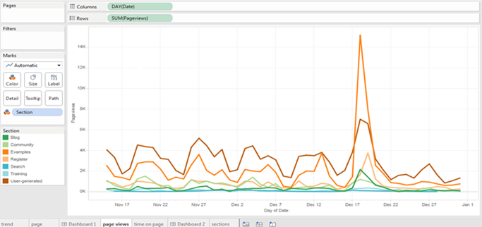
The page views trend over a period of time.
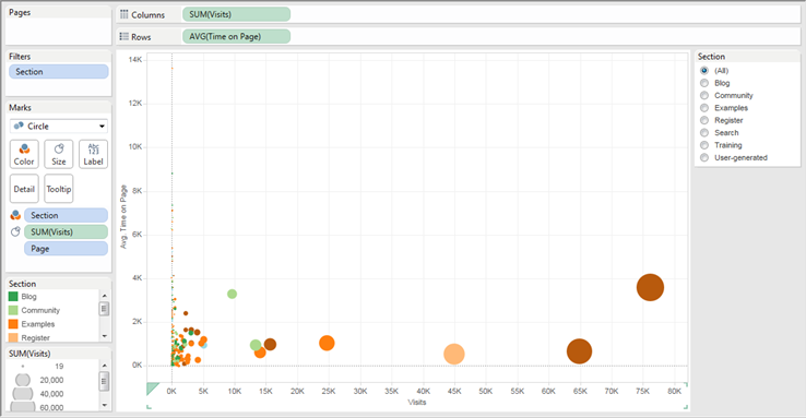
Average time on page over a no. of visits, here the colors shows the different sections.
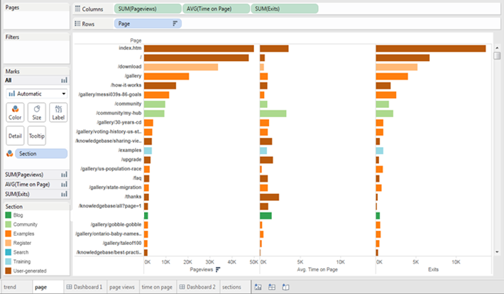
The below visualization explains about how many views for particular page, what is average time on every page and number of exits of each page.
Benefits
Innovative and interactive DashboardThe interactive dashboard of Tableau gives results that are dynamic and visualizations that are rich can be created easily. Documents, web pages and images can be added to the dashboard easily for storytelling.
Easy sharing and publishing
The results after analyzing the data, can be shared with just few clicks. Furthermore, it is easy to share the dashboard that is published live on mobile and web devices.
Rich Visualizations and ease of use
Simple and ease of use by just using a drag and drop features. With no knowledge in programming also you can start using Tableau.
One of Worlds best Data Visualization
Tableau has given business users the features and ability to perform data visualizations which are complex in a simple drag and drop manner. Furthermore, these data visualizations are rich, impressive and very interactive. The user can highlight sections and check charts without much technical skills or assistance.
Mobile Support
The main feature of the Tableau is the excellent mobile support. The controls that are touch-optimized to view data and visualizations are well streamlined for mobile devices automatically. Tableau has the higher percentage of users using in mobile devices. With excellent and innovative data visualization tools, Tableau is a successful company. It provides end-user the features and ability to create rich data visualization. Large customer resources and base, impressive integration and excellent customer support are the best benefits in Tableau.
We use cookies to provide the best possible browsing experience to you. By continuing to use our website, you agree to our Cookie Policy

